I’ve been thinking about what sort of articles I would prefer to write for this blog, and what direction I would like to take it.
A part of that decision has to be, what do my current readers, and my future readers, want to read.
One of the trends I have been noticing is that I seem to get more of a response to the geeky articles than the non-geeky ones.
In keeping with that trend, here’s a geeky analysis of that trend.
In early September, I installed some tracking software to help me better understand which pages are popular.
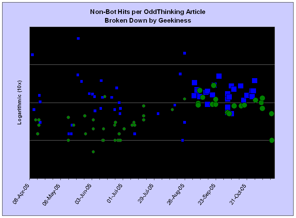
I have taken that data, discarded the hits from top-40 most-aggressive bots, broken it down by whether the post was categorised as “Geeky” and plotted the number of page hits against the date of the initial post.
To quickly read the graph you will need to know:
- Geeky articles are indicated by a blue square (how apt!), non-geeky ones by a green circle.
- Articles originally posted before the metrics were initially gathered are indicated by a smaller symbol.
- It is a logarithmic scale. Each horizontal line represents ten times as many hits as the line below.

To really understand the graph, you will also need to know:
-
More recent posts (bigger symbols) haven’t had as long to gather the “long tail” hits.
-
Older posts (smaller symbols) are under-estimates, because the initial traffic (between posting and early September) has not been counted. Only the “long tail” is being counted.
-
This only counts articles read on their own page – i.e. via the permalink. Reading articles as part of the home page or the archives pages doesn’t give it credit. (I am thinking of making changes to this behaviour.)
-
I have taken steps to obscure the actual numbers. I don’t want this to become a pissing-up-against-the-wall contest with other bloggers.
Applying my standard statistical analysis (inter-ocular impact), it’s pretty clear that geeky posts tend to get significantly more hits than non-geeky ones, especially in the long-tail.
You must be logged in to post a comment.