Let’s start with a little challenge.
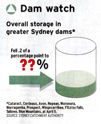
The following graphic was taken from today’s Sydney Morning Herald. I scanned it because I was unable to find it online.
It shows the sorry state of the reservoirs feeding drinking water to Sydney. I have chopped out the actual percentage.
The challenge is for you to guess, based on the arrow and graphic, what percentage the current water levels are at.

Now, far be it from me to suggest that the Sydney Morning Herald is in any way biased, but if it was to be biased… well let’s just say they endorsed the Opposition before the recent elections – that is, the party that isn’t the ones who they are blaming for NSW infrastructure problems.
And, far be it from me to to suggest that sensationalising the risk of a water crisis in NSW would be a great way to sell more newspapers. I am sure the Sydney Morning Herald, paper of record, wouldn’t stoop so low.
So how did you go?
If you suggested that the number would be about 23-25%, you did very well. According to my measurements, that is about the level that the graphic indicates.
So what is the real number? The number that they sourced from the Sydney Catchment Authority?
38.3%
That’s about 60% bigger than the figure the graphic would indicate.
With 50mm of rain in Sydney in the past week (but not sure how much in the catchment area), I would be betting that tomorrow’s figures show a further increase.
You can do better, Granny.
Comment by Alastair on April 11, 2007
Not excusing them, but at least they didn’t confuse percent with percentage point. AND they cited their sources.
By the way can I nominate this article for the best/worst of OddThinking headlines? Very clever.